e-Core · 2026
A rebrand that unified a fragmented brand, with a Design System to keep it that way
I led e-Core's rebrand to unify the brand and align the identity with the company's current positioning. Then I created and evolved the Design System that keeps it consistent day to day.
Project sheet
- Company
- e-Core
- Period
- 2026
- My role
- Global Design Lead
- Team
- 3 designers
- Skills
- Branding, Design System, Enablement, Stakeholder management
- Tools
- Figma, Claude
- brand consistency across deliverables
- 60% → 90%
- production speed with the Design System
- +60%
- to build the Design System, with help from Claude
- 1 week
Context
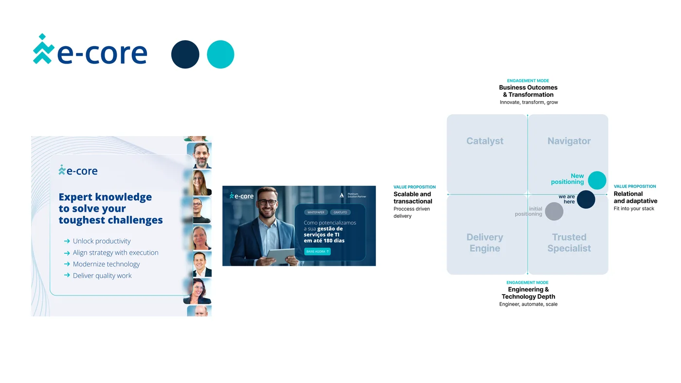
e-Core works in two very different markets, Latin America and North America, and each followed its own path, which fragmented the identity. HR used one version internally and employer branding another externally, while agencies and departments created variations without consulting design. In practice there were two identities: North America's, cleaner and more modern, and Latin America's, built on dark blue. The positioning had also changed: the company had moved from a technical, transactional supplier to a strategic consultancy, and the identity hadn't kept up.
Project steps
- Brand audit in both markets
- Positioning and strategy
- Initial concept and brand book with Notebrand
- Identity evolution and usage parameters
- Design System MVP in 1 week, with Claude
- Presentation to stakeholders
- Enablement and evolution through use
- Consistency audit (60% → 90%)
My role
I led the rebrand end to end, in a collaborative process. Notebrand, a design agency, delivered the initial concept and brand book, with me coordinating the art direction and strategy. I then evolved and adapted parts of the identity, defined the usage parameters and produced the entire Design System. My team took part in every decision, and I defended the choices with stakeholders and followed adoption across teams.
Decisions
Identity serving the positioning
Aligned the visual identity with the company's current positioning. The tone became more consultative and less technical, which guided the identity decisions.
Keeping the anchors
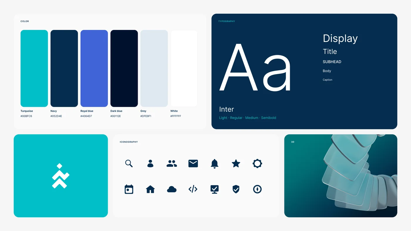
The logo and colors were what people already recognized, so they stayed. We recalibrated the turquoise and navy and added a royal blue with a subtle purple undertone, to widen the palette without breaking the system's logic.
From dark to light
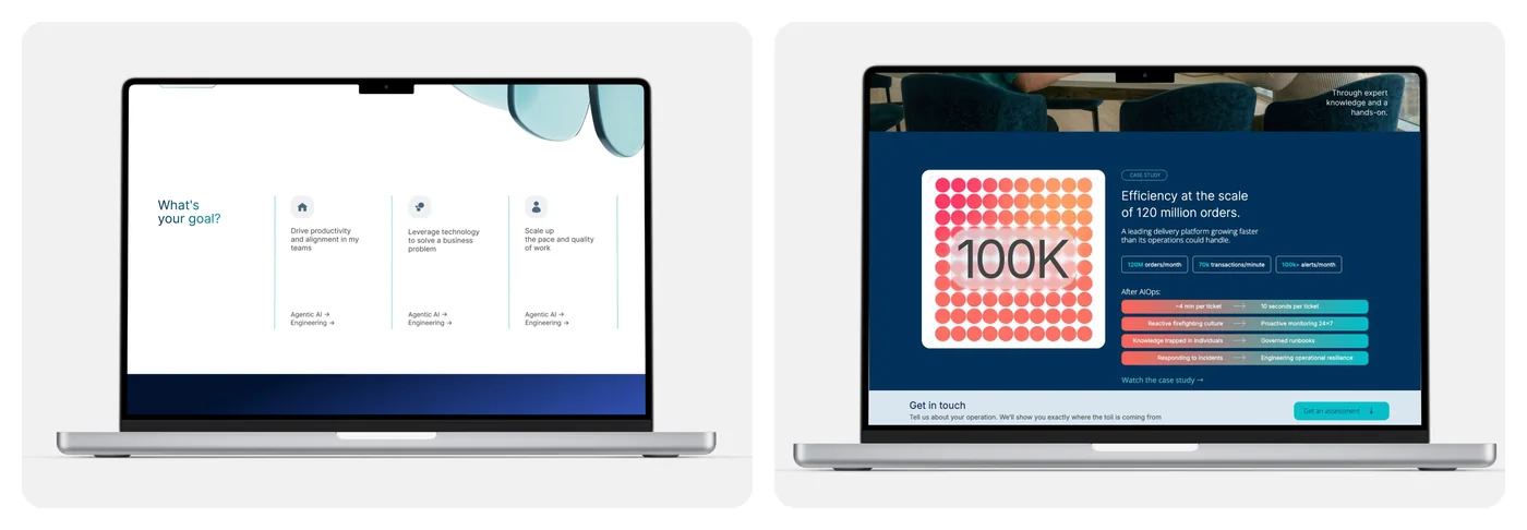
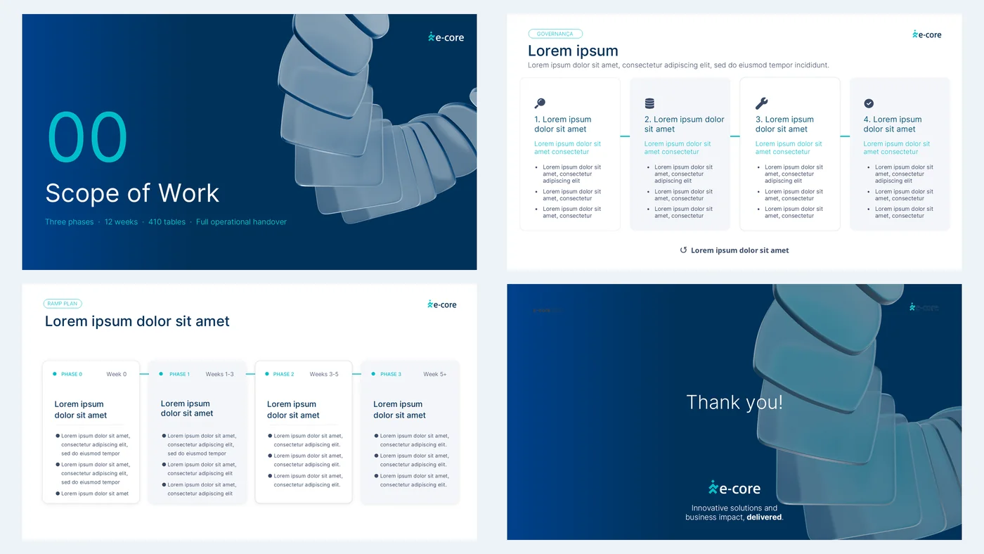
Dark backgrounds signal the more technical side of technology. We flipped the scheme: light mode became the standard, and dark mode is kept for high-impact moments, in about 20% of pieces.
Typography with character
We replaced Open Sans, generic and too thin for long text, with Inter, which has more character without losing lightness.
Elements that carry the brand
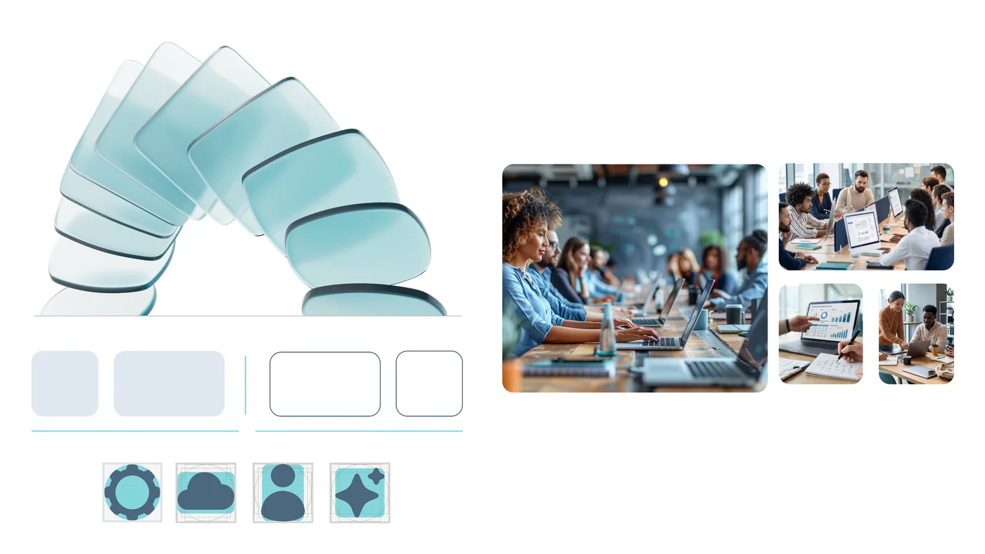
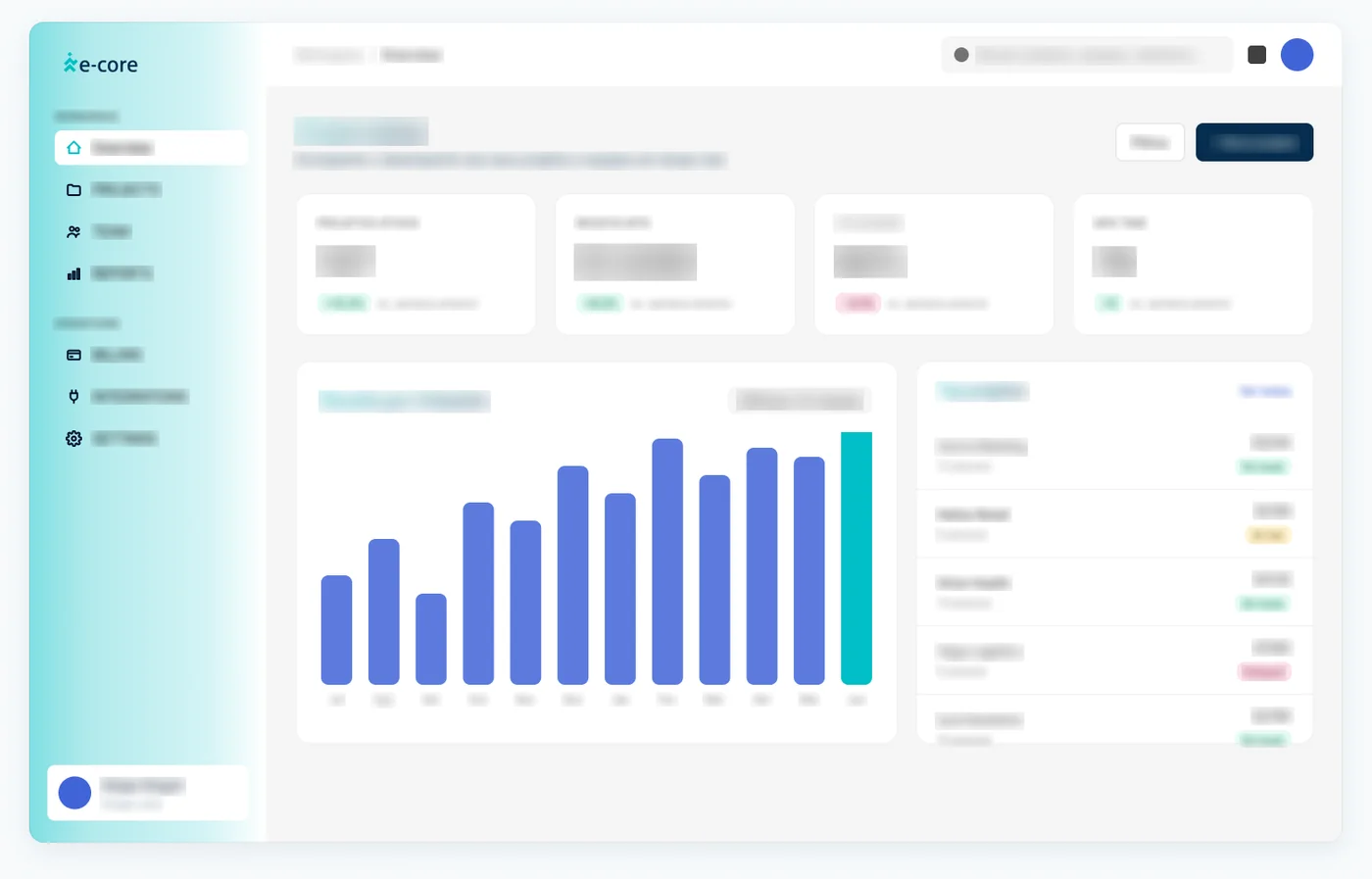
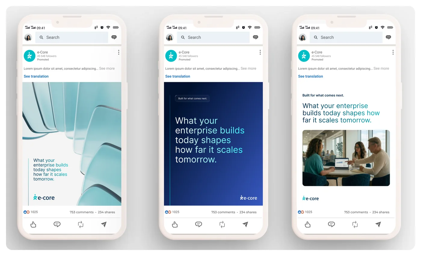
We built a custom set of 3D glass elements, expressing transparency, lightness and adaptability, and expanded the use of gradients. Icons became solid, shapes got rounded corners and photography shows real people collaborating.
Decisions defended, not imposed
Presented and defended the design decisions to stakeholders.
A system, not a manual
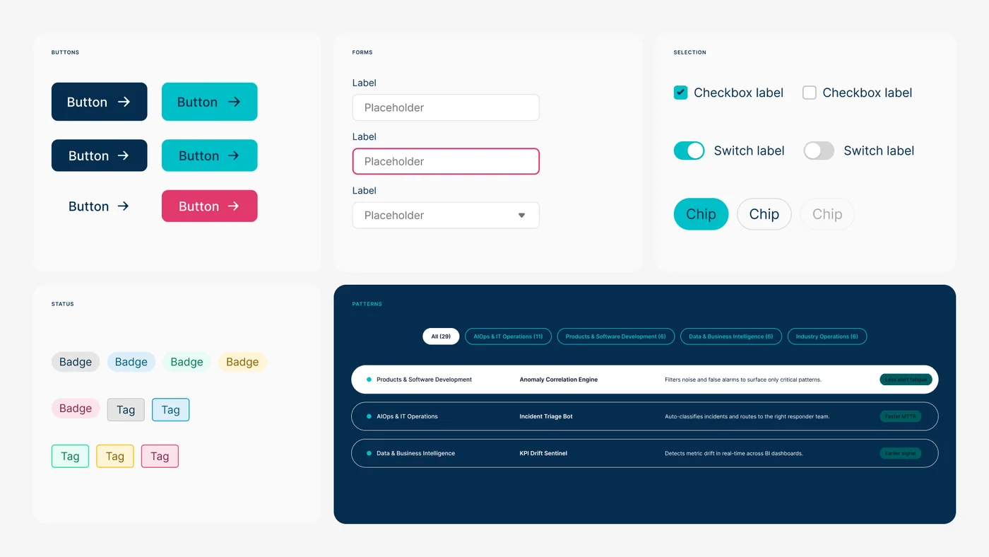
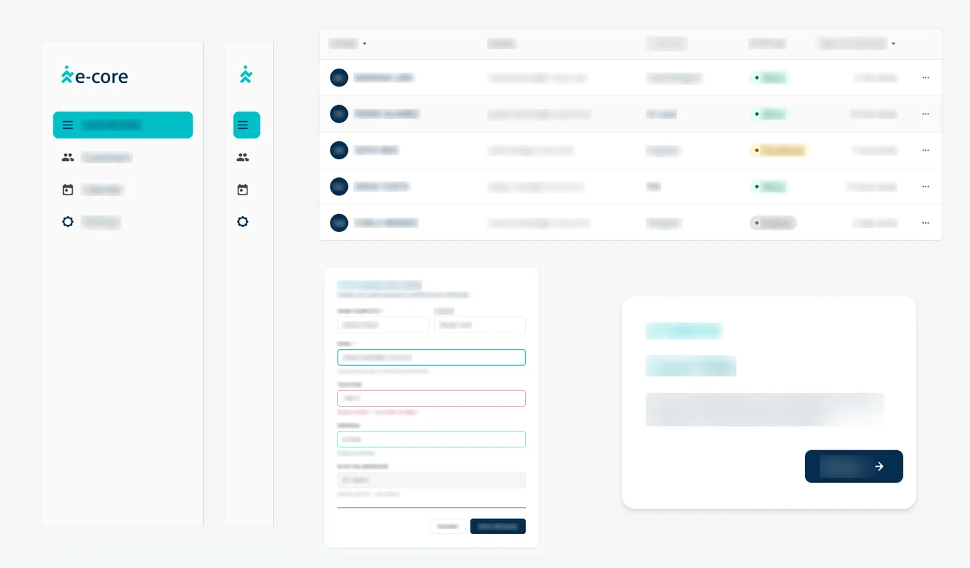
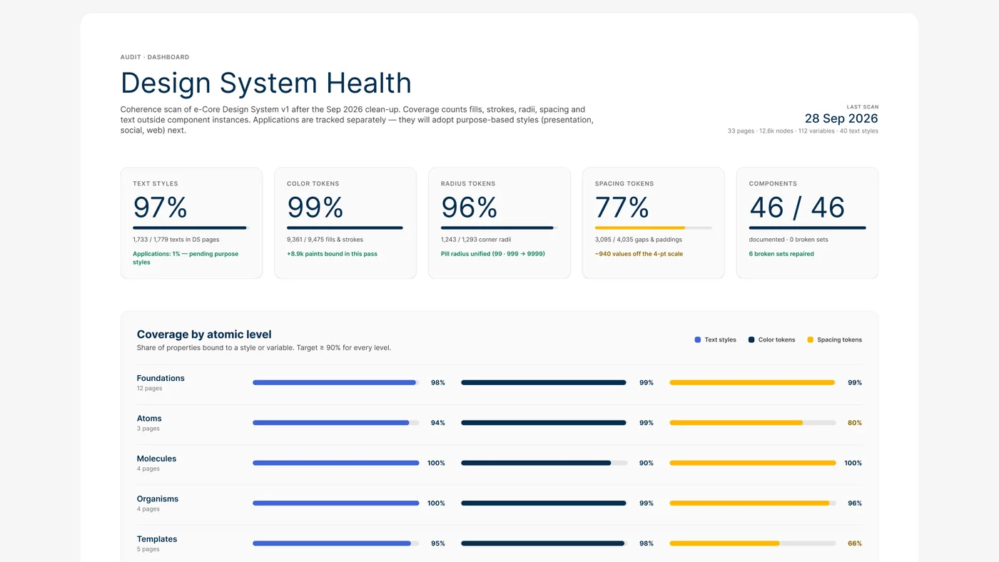
Built the Design System in one week, with help from Claude, following atomic design: foundations, atoms, molecules, organisms and templates. It has 33 pages, 46 documented components, 112 variables and 40 text styles, plus the rules and templates for deliverables.
Made for people and for AI
I designed the system to be useful day to day for whoever is creating, whether a person or an AI. Named tokens, documented components and clearly written rules let the team produce fast without leaving the brand, and they are fuel for AI, which reads the system to generate on-brand work.
MVP first, then evolve with use
We worked in an agile way: we delivered an MVP of the brand and the Design System, then kept building and evolving the system based on practical feedback from the people using it every day.
A brand only exists if it's used
Led enablement and follow-up with teams so the new brand was adopted.
Solution
A single identity for every market, documented in a mini brand book, covering positioning, messaging and visual guidelines, and in the Design System. The brand book includes website and social layout examples, with the color proportion for each composition, and the sales presentation template already follows the new rules. The same system is the base for the AI skills teams use to create presentations, with photos, icons and 3D mockups.
Results
Production got 60% faster and brand consistency across deliverables went from 60% to 90%. To measure it, we used Claude to compare the audited pieces with the old Design System, then ran the same audit on materials made with the new one. In the audit of the system itself, in September 2026, 99% of colors and 97% of text were bound to tokens and styles.
What I take away
A rebrand is only finished when people can apply the brand on their own. Enablement is part of the project.