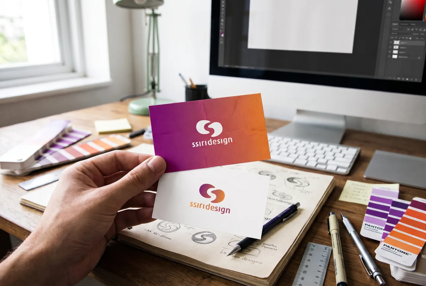
Identity and communication · 2011–2018
Brands that become communication, from symbol to stationery
An objective summary of identity and communication projects I did through SSiri between 2011 and 2018. In each one, the brand was designed to reach everyday pieces: stationery, printed materials, signage, website and social media.
Project sheet
- Company
- Wisen, SOMA, B4B, Glamor e outros
- Period
- 2011–2018
- Type
- Identity and communication
- My role
- Brand and communication designer, through SSiri
- Skills
- Branding, Visual identity, Communication, Stationery
- Tools
- Illustrator, InDesign, Photoshop
What I did
Naming, symbol and logotype, brand book, stationery, printed materials, signage and social media templates, depending on each project.
Camila Curti · personal chef · 2018
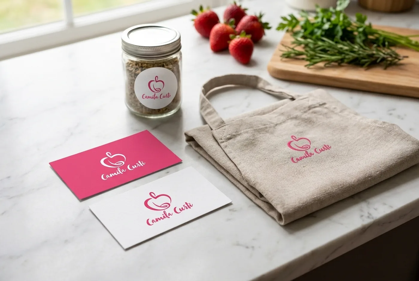
I created the verbal and visual identity for Camila Curti, who was starting out as a personal chef. Since social media was her main channel, the brand was born with templates and formats for producing content quickly. The brand brings together nutrition, care and gastronomy. The project took 1 month.
Wisen Engenharia Elétrica · 2017
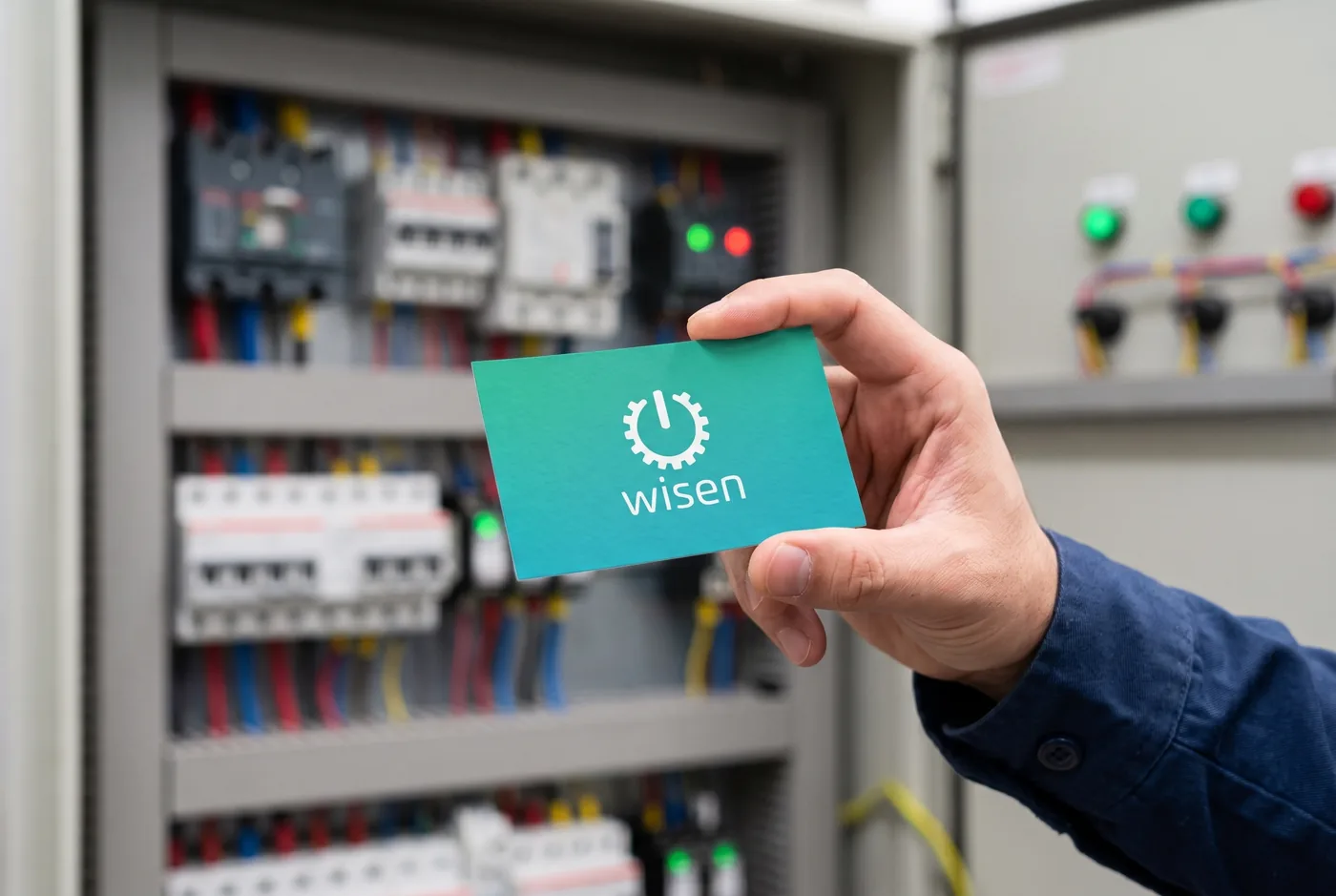
For Wisen, an electrical engineering firm, I designed a symbol that combines the power button and a gear. The identity became a brand book, business card, ID badge and presentation template, so the company would present itself the same way at every touchpoint.
SOMA Arquitetura e Urbanismo · 2015
SOMA's symbol is a floor plan drawn from the plus sign. From it, I created the brand book, stationery, presentation covers, construction site sign and the studio's signage.

B4B · Business for Better · 2013–2014
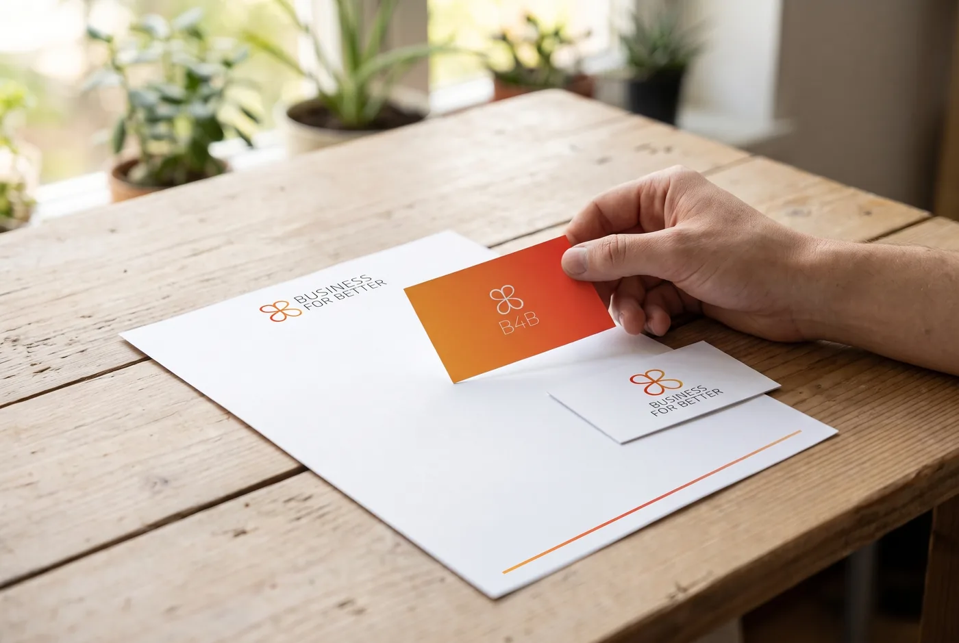
For B4B, Business for Better, the symbol combines the butterfly, the cycle and the letters of the name. I also designed the brand book, the stationery with an orange gradient, the "Change the world with us!" folder and the website.
Matre Consultoria em Seguros · 2014
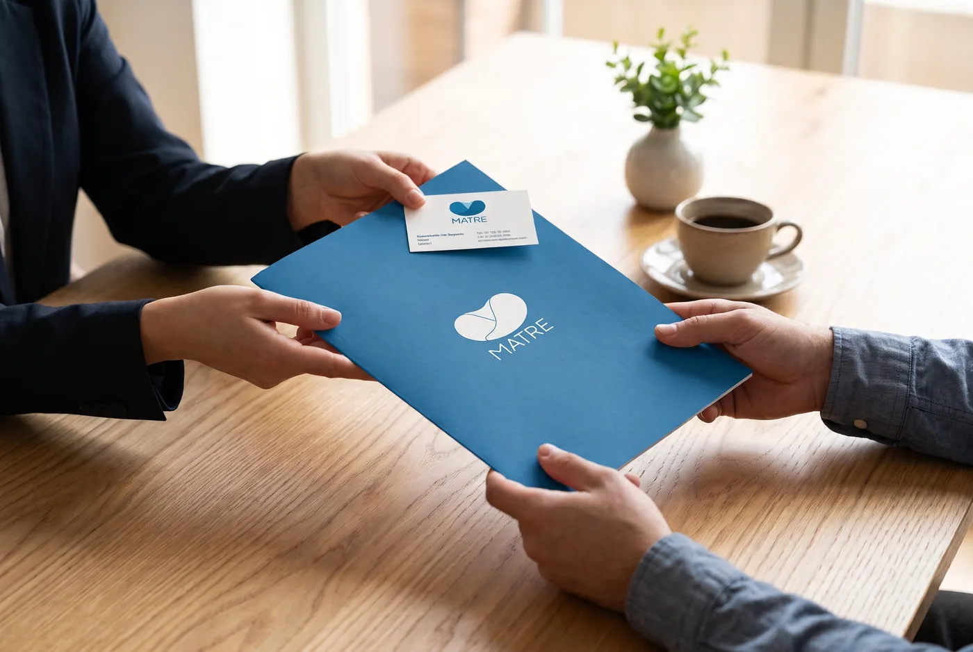
For Matre, an insurance consultancy, I created the name, the identity and the tagline "The support you need". Communication kept the same caring tone across the brand book, stationery, folder and brochure.
Cautio Odontologia Moderna · 2014
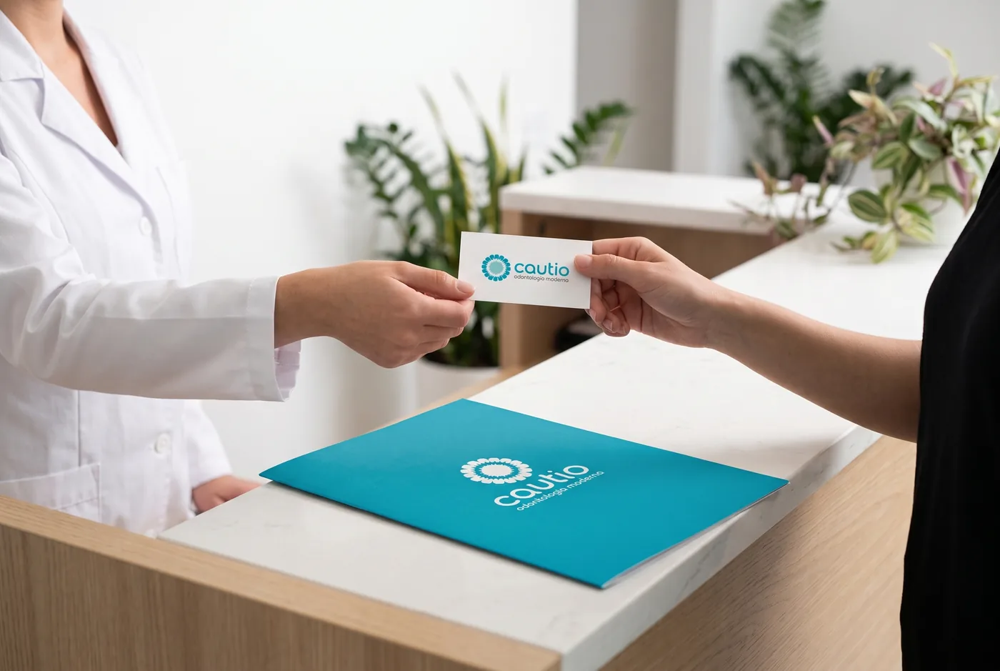
For Cautio, I created the name, the tagline "modern dentistry" and a flower-shaped symbol made of teeth. The brand also went into the stationery, appointment cards and the clinic's interior graphics.
SINTRACON-SP · 2014
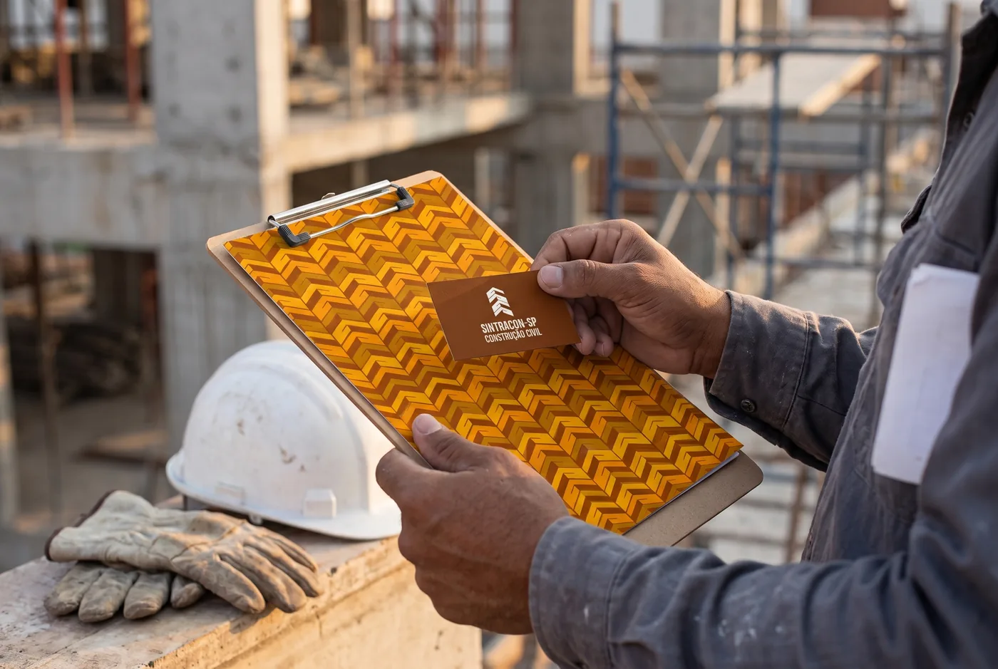
For the São Paulo construction workers' union, the symbol combines brick, joined hands and home, and becomes a graphic pattern. The pattern appears in the stationery and the headquarters' interior graphics.
Elisangela Pichinin · fotografia · 2014
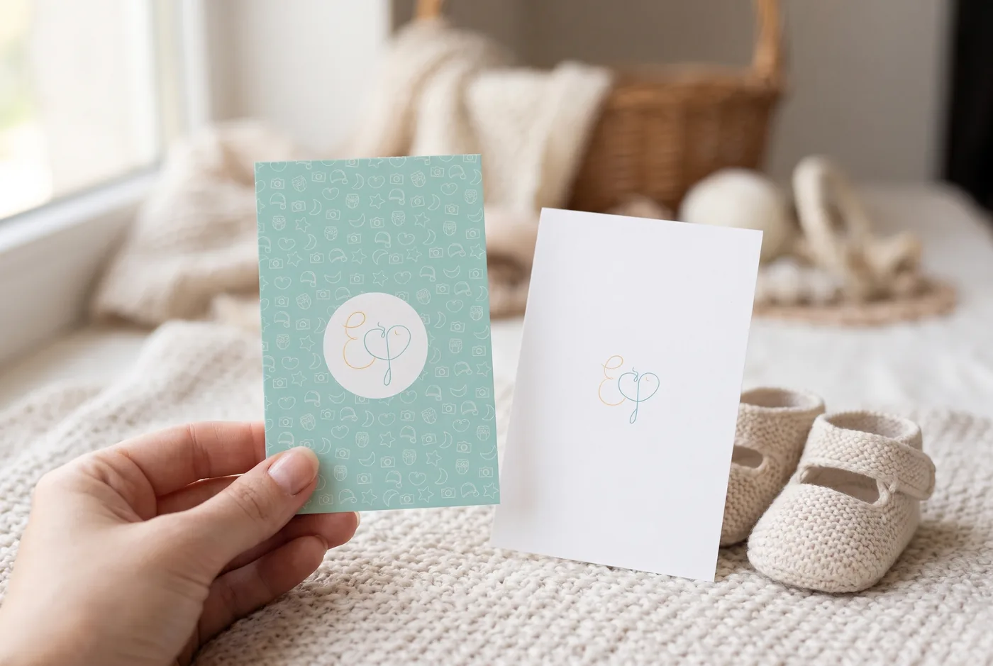
For photographer Elisangela Pichinin, who photographs expectant mothers and newborns, I designed delicate initials, an icon pattern and a soft palette. The identity was applied to the stationery, the flyer and the studio's façade.
Glamor · perfumaria · 2014
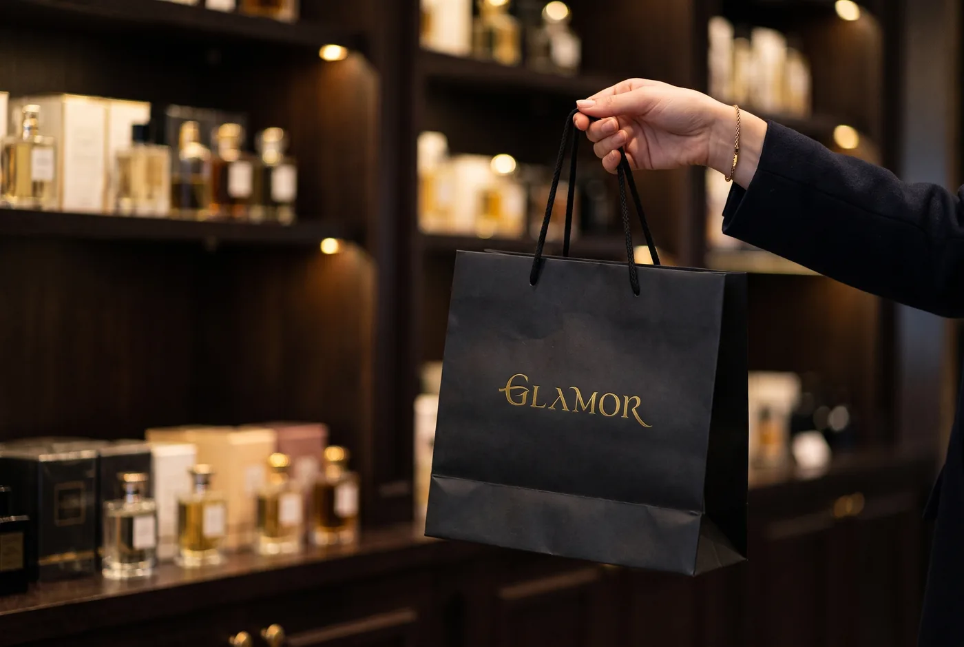
A shopping mall perfumery asked me to create its name, visual identity and store environment. The symbol combines a swan, a female silhouette and the letter G, and appears in gold on black on the business card and shopping bag.
Matecshop · 2012
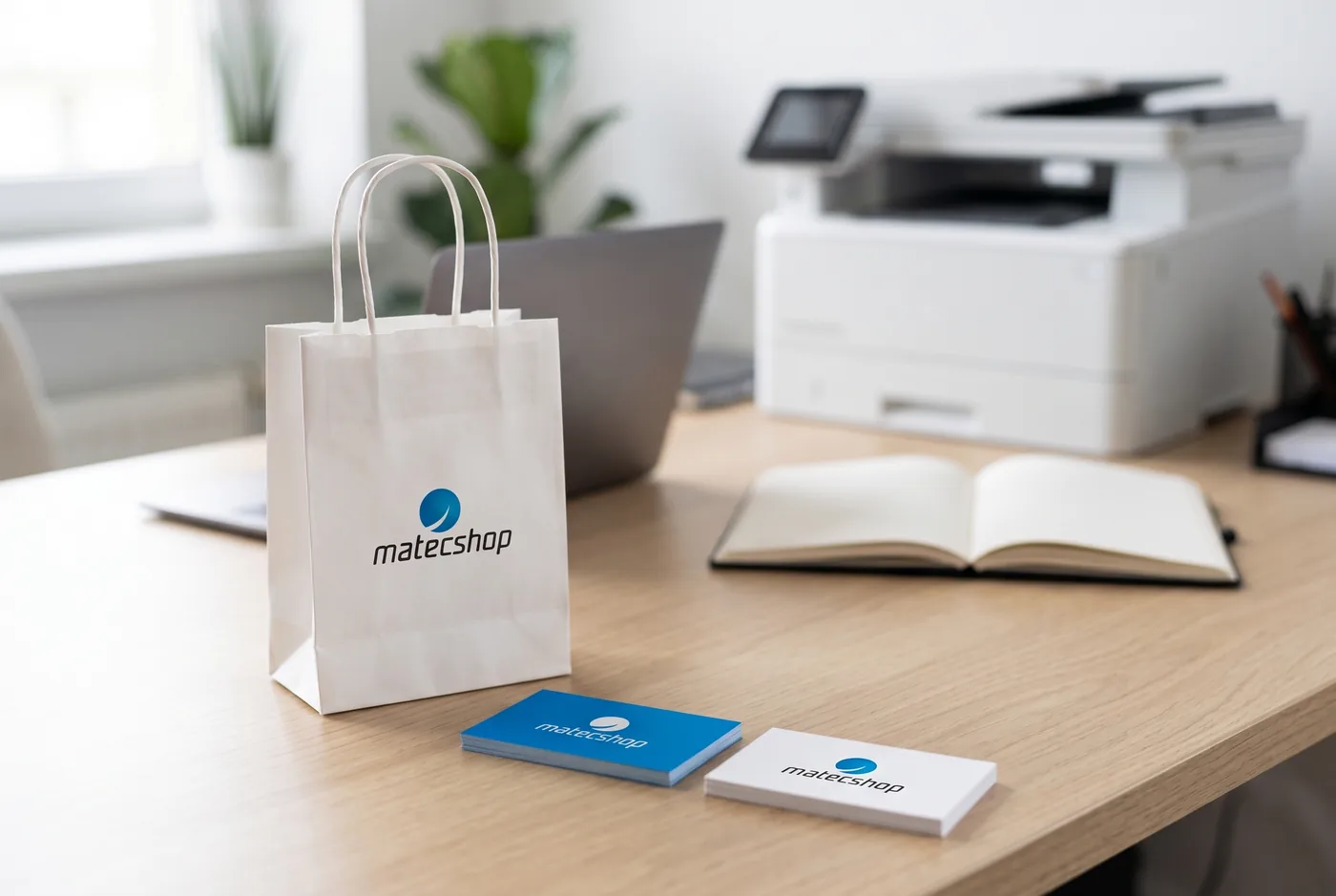
For Matecshop, an online store for computer products, mainly printers, the symbol starts from a circle and rising bars, with a short version, matec, for smaller spaces such as the bag and labels.
SSiri Branding & Design · 2011
The brand for my studio, which I ran until 2021. The symbol combines a handshake, a crab (siri, in Portuguese) and my name, and went into the brand book, stationery, website and the studio's communication pieces.