Prosperidade Conteúdos · 2021–2023
Rebrand and design system for a consultancy serving major brands
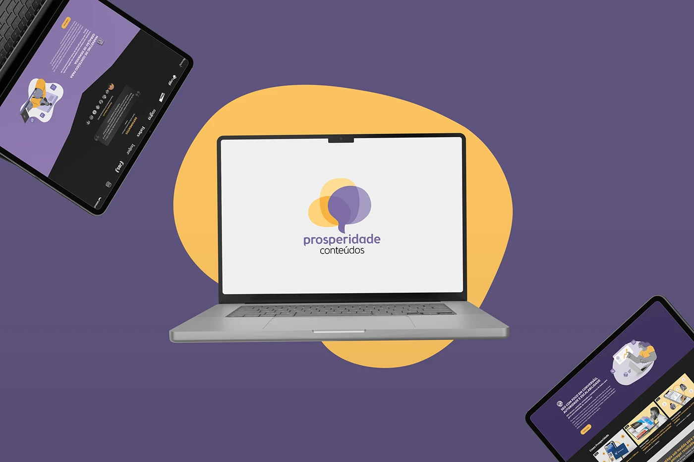
A small content and SEO consultancy with large clients had a positioning that undersold its work. I led the brand, website and design system.
Project sheet
- Company
- Prosperidade Conteúdos
- Period
- 2021–2023
- My role
- Design manager and brand lead
- Team
- 4 designers
- Skills
- Branding, Research, Design system, Illustration
- team time saved
- 50%+
- pages of brand diagnosis
- 60+
Context
The identity was dated and the brand poorly positioned, because it tried to cover too many things at once. It lacked a visual and verbal strategy to support the kind of client the consultancy wanted to win.
Project steps
- Brand assessment and partner interviews
- Market research
- 60+ page strategic diagnosis
- Logo routes and choice with the partners
- Complete identity
- Website and design system
- Evolution through use
My role
I defined the brand positioning with the CEOs, we built the identity on that strategy and evolved it with use over the years. I also led the website and the design system, through to the team maintaining it.
Decisions
Listening before proposing
Audited the existing brand, interviewed the partners and ran market research.
Strategy in writing
Wrote a 60+ page diagnosis covering visual and verbal strategy, advantages, risks and scenarios.
A collaborative choice
Designed several logo routes, and the final one was chosen with the partners.
A complete system
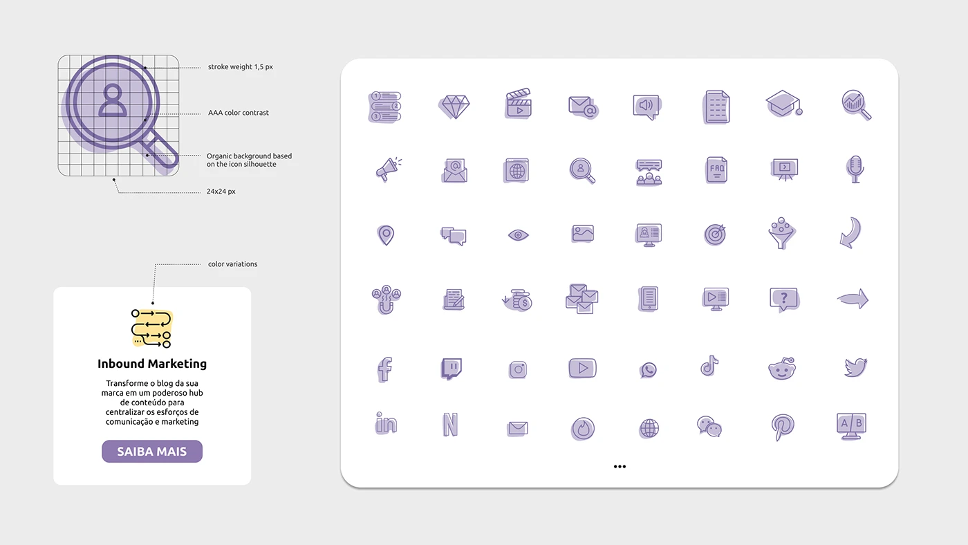
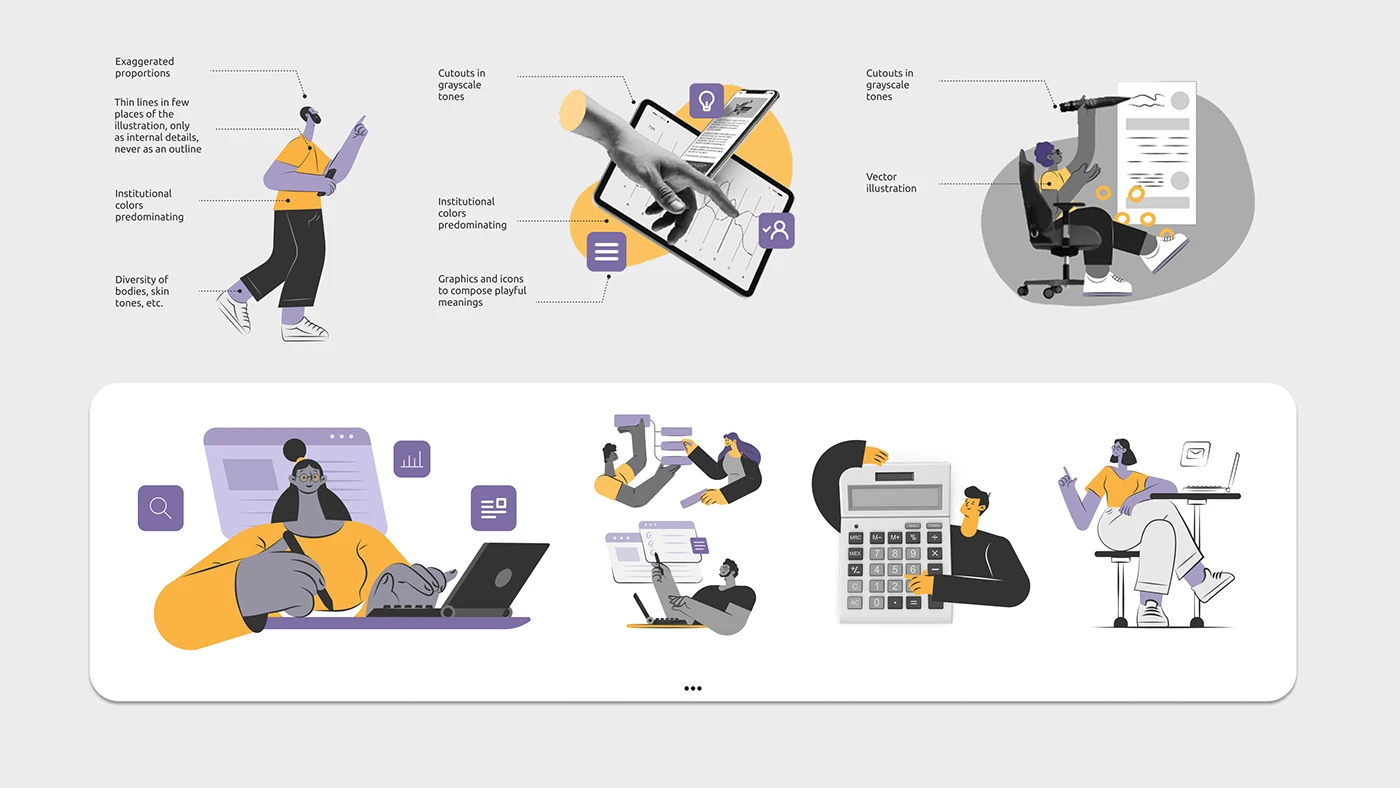
Built the full identity: illustration, iconography, color ratios, grids, typography and photography.
Solution
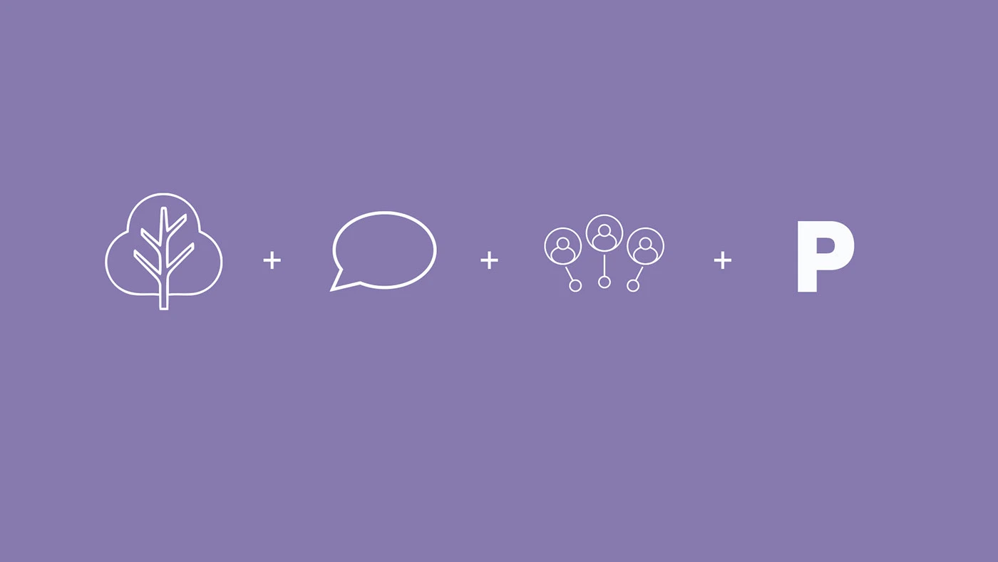
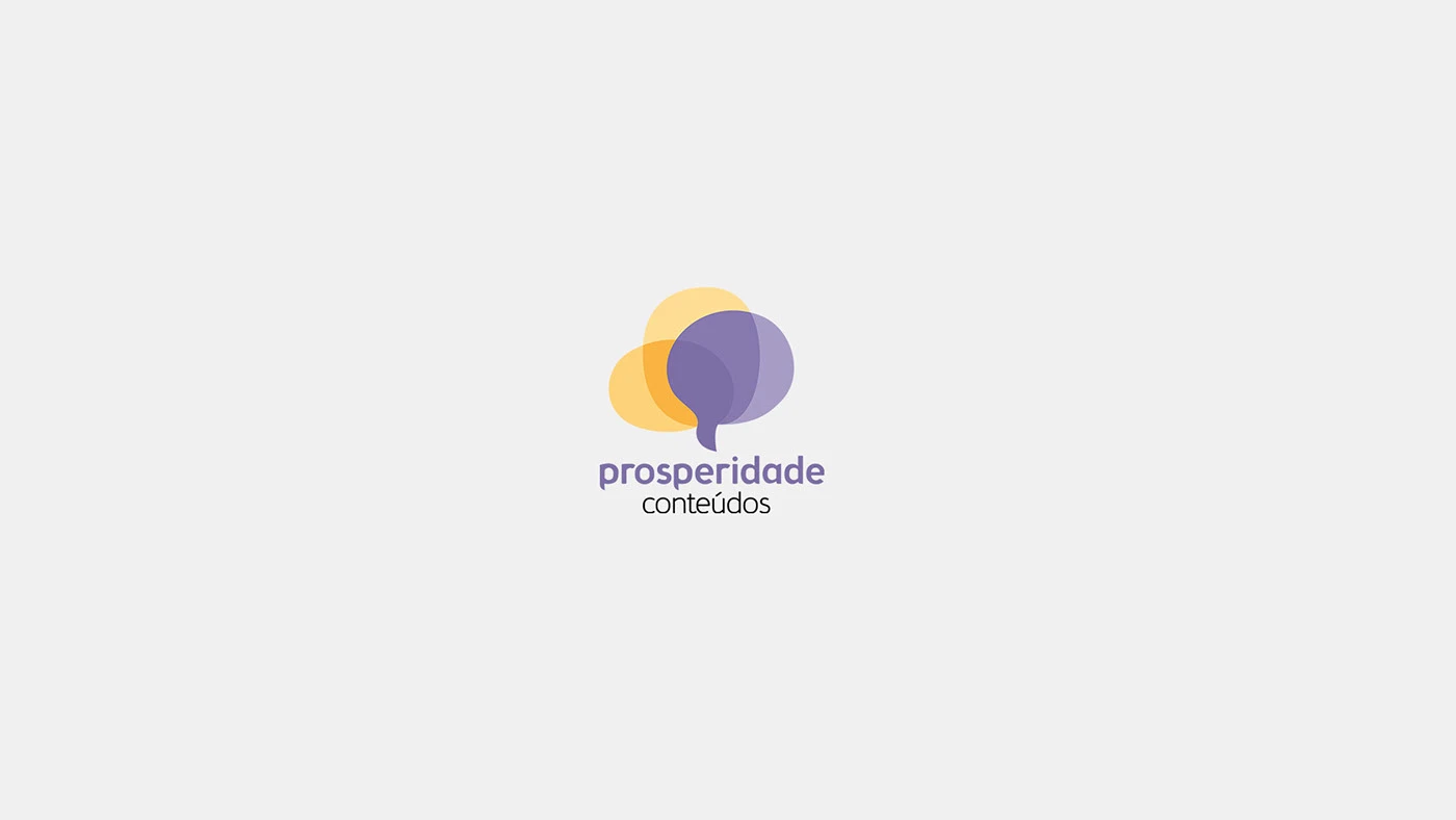
The symbol combines a tree (prosperity), speech bubbles (content as conversation) and the overlap that forms the P (collaboration). I built a lean design system the team itself extended with new tokens and components as needed. The identity was simplified as the brand matured and targeted more serious clients.
Results
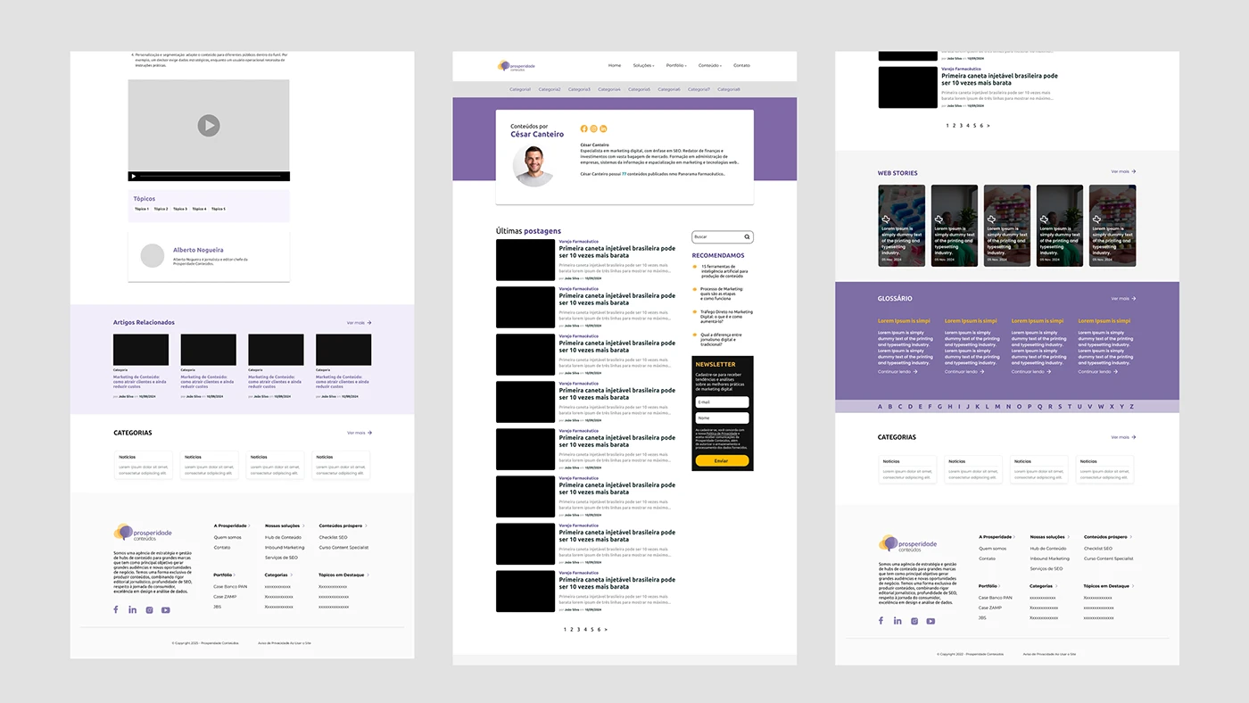
The team reported saving more than 50% of production time with the design system. The brand gained a coherent system for the website, presentations and collateral, and evolved with its positioning.
What I take away
A small, living design system maintained by the people who use it delivers more than a complete library nobody updates.