Banco PAN · 2021–2022
A content platform that became the bank's main organic channel
Banco PAN wanted to compete with Nubank in content marketing, but its blog drove only 9% of purchase-journey traffic. I led the design workstream from diagnosis to delivery.
Project sheet
- Company
- Banco PAN
- Period
- 2021–2022
- My role
- Design lead
- Skills
- UX/UI, Design system, Content, Branding
- Tools
- Figma, Google Analytics, Hotjar
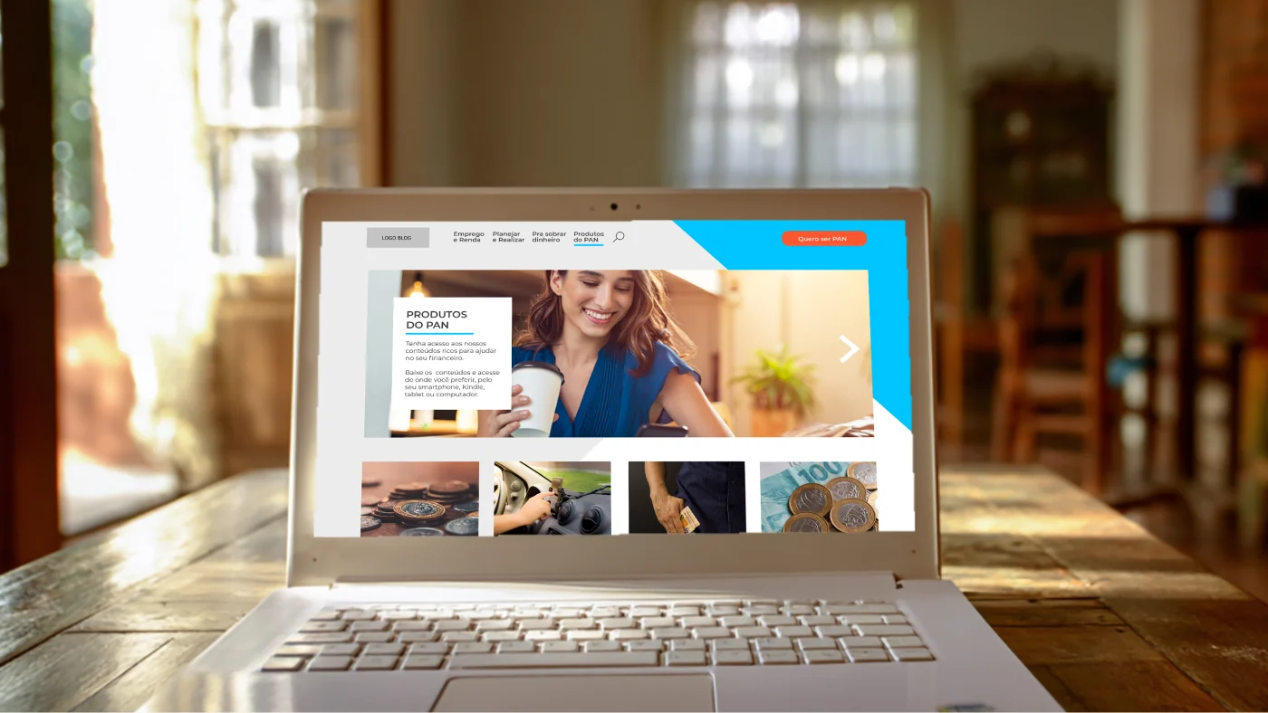
- organic traffic in one year
- +1,141%
- hub share of the purchase journey
- 9% → 43%
- saved on paid media
- R$ 5M/year
Context
The blog followed the corporate website layout and ignored how people actually read content. It had serious usability issues, few working CTAs, and most of the team's budget went into paid media.
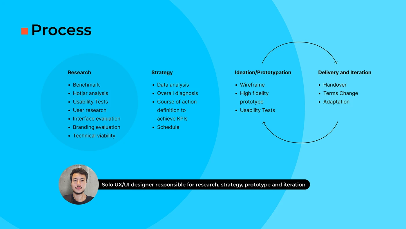
Project steps
- Usability and journey diagnosis (double diamond)
- Action plan prioritized by goal and budget
- Illustration, icons and photography
- Wireframes and navigation testing
- High-fidelity prototype with 20+ pages
- Replanned as an evolution of the blog
- Launch and measurement
My role
I led the design workstream in a project combining content, design, growth and marketing, from user research to launch.
Decisions
Diagnosis before design
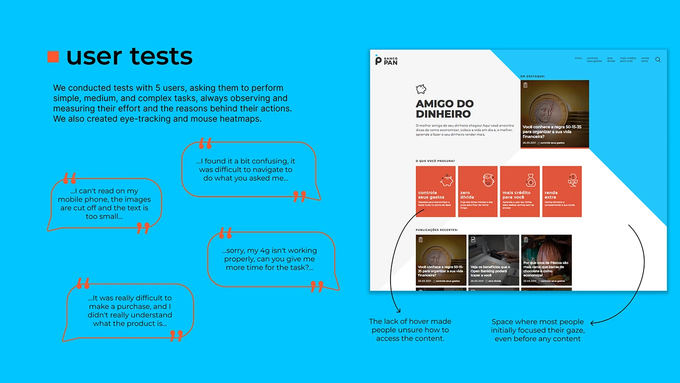
Ran an in-depth usability and reading-journey diagnosis using the double diamond.
Priorities set by goal and budget
Built an action plan prioritized by goal and available budget.
Illustration that conveys trust
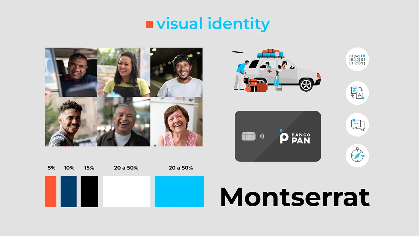
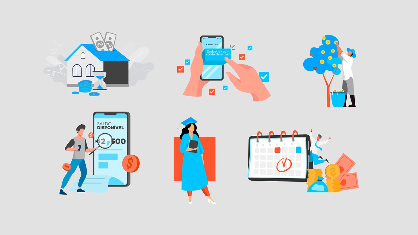
Refined the identity with new illustration, iconography and photography standards, restrained enough for a bank.
Testing navigation before UI
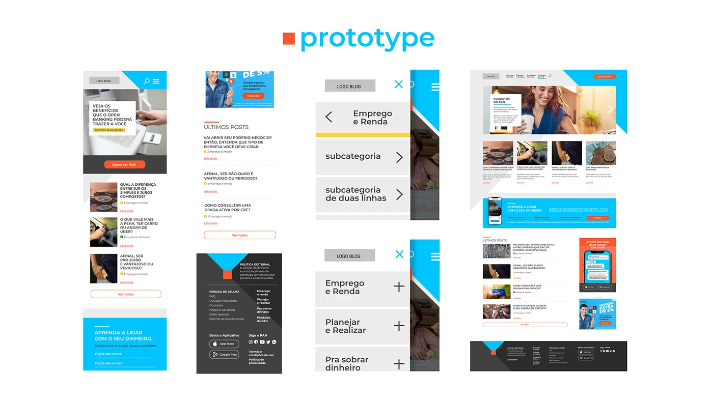
Built wireframes to test conversion-focused navigation, then a mobile-first high-fidelity prototype of 20+ pages.
Solution
The full hub could not be built because of internal constraints at the bank. To keep the same level of delivery, we designed an evolution of the existing blog: manually placed CTAs, color-coded categories, interactive infographics adapted to static use, and dozens of small fixes built into the content routine.
Results
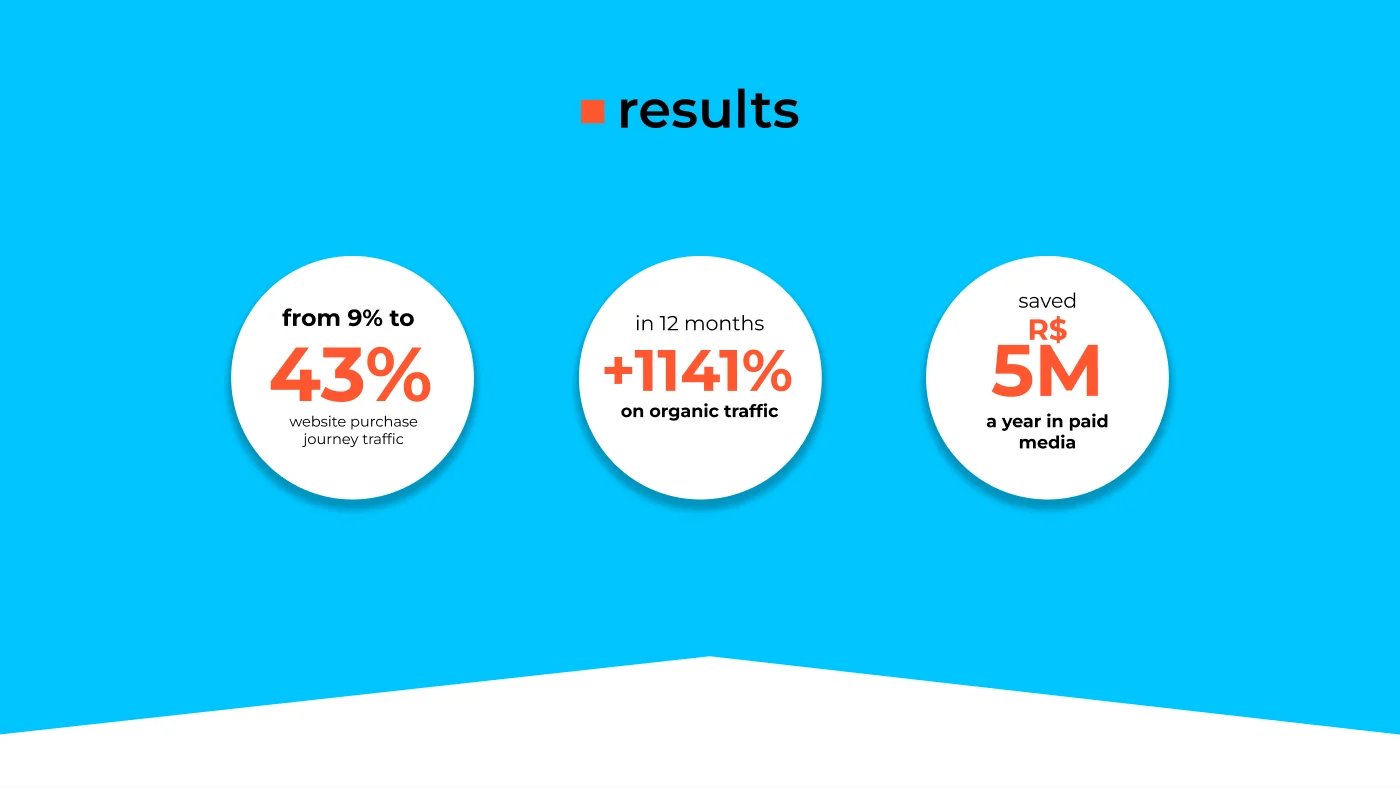
Within a year the hub accounted for 43% of purchase-journey traffic and organic traffic grew 1,141%, that year a higher rate than Nubank itself. The bounce rate fell 50% and the hub came to generate more than half of the bank's digital leads. With organic as the lead channel, the bank saved R$ 5 million a year in paid media.
What I take away
A well-diagnosed plan survives a change of course. When the ideal solution stalled, the same priorities guided the workable fixes.